Dotplots
Introduction
Our website provides dynamically-generated dotplots. Dotplots are useful for visualising the ohnologous relationships between chromosomes from different species. Whole genome duplicaiton events create a copy of every chromosome in the genome. As a result, when we compare all the chromosomes between two species that share a WGD event, we expect to see a 2:2 correspondance between chromosomes (or chromosomal segments after multiple rearrangements have occured), though this may not be the case due to subsequent whole genome duplications in the respective genomes.
Dotplot settings
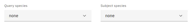
In order to display a dotplot, you must first select the query and subject species that you wish to compare. This can be done by picking both species using the appropriately labelled dropdown menus. Once both species are selected, the dotplot will appear below.
Reading the plot
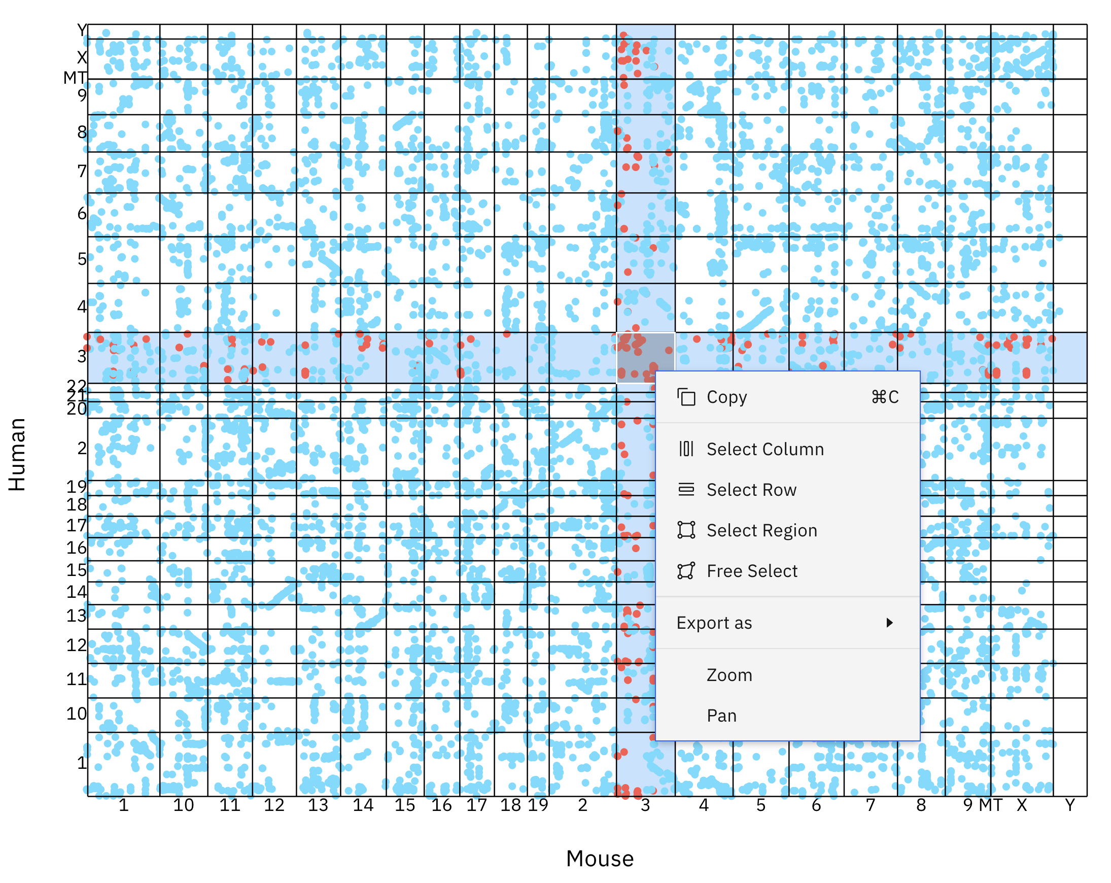
The chromosomes of the query (x-axis) and subject (y-axis) species are labelled and displayed in a grid - each box represents a chromosome-chromosome comparison. Blue dots represent homologous relationships between genes located on the query and subject chromosomes.
When examining the synteny between chromosomes, there are two major patterns; We can see micro-synteny as stretches of diagonal lines. These sections of chromosomes are homologous and have not gone through many rearrangement or gene shuffling events - the gene order has been preserved. Another noteworthy pattern is that of macro-synteny. We can identify this by looking for clouds of homologous genes between chromosomal segments. While these segments contain a high amount of homologous genes, their order has been shuffled over time.
You can interact with the plot by hovering your mouse cursor over any of the boxes - this will highlight the current box, row, and column. Right clicking on a box will open a context menu that will allow you to perform several actions:
Select region
This feature will highlight and add all of the genes in the current box to your selection.
Select row
This feature will highlight and add all of the genes in the current row to your selection.
Select column
This feature will highlight and add all of the genes in the current column to your selection.
Free select
This feature will create a movable and re-sizable box on the plot. Any genes in this box will be highlighted and added to your current selection.
Data table
All genes belonging to the query and subject species will be shown in a table below the dotplot. The table displayed on this page follows our standard layout, you can read more about it here here.
Data download
Gene data used for generating the current plot can be selected downloaded. You can read more about selecting table entries here.
Linking
You can view more information about a gene by clicking on any of the entries listed under the source table column.
You can also jump to the gene tree or synteny data visualisations containing any particular gene entry by clicking any of the links in the protein column. You can read more about data linking here.